Creating an Animated GIF with R
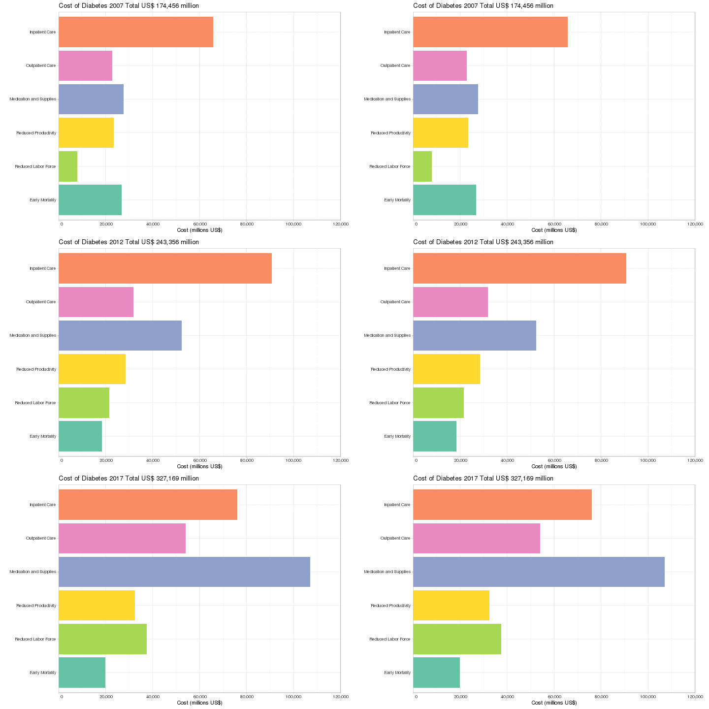
One of my latest tasks was to create a smooth transition between data sets, instead of showing line graphs or having multiple graphs side-by-side. Fortunately, existing libraries in R make this quite easy to accomplish. Specifically, I will make extensive use of ggplot and tweenr.
Here’s the data we will be working with. All numbers are in millions US$.
| Year | Source | Cost |
|---|---|---|
| 2007 | Inpatient Care | 65830 |
| 2007 | Outpatient Care | 22742 |
| 2007 | Medication and Supplies | 27684 |
| 2007 | Reduced Productivity | 23400 |
| 2007 | Reduced Labor Force | 7900 |
| 2007 | Early Mortality | 26900 |
| 2012 | Inpatient Care | 90652 |
| 2012 | Outpatient Care | 31798 |
| 2012 | Medication and Supplies | 52306 |
| 2012 | Reduced Productivity | 28500 |
| 2012 | Reduced Labor Force | 21600 |
| 2012 | Early Mortality | 18500 |
| 2017 | Inpatient Care | 76164 |
| 2017 | Outpatient Care | 54001 |
| 2017 | Medication and Supplies | 107104 |
| 2017 | Reduced Productivity | 32500 |
| 2017 | Reduced Labor Force | 37500 |
| 2017 | Early Mortality | 19900 |
Let’s start by loading our necessary libraries and loading our data set.
library(animation)
library(ggplot2)
library(RColorBrewer)
library(tidyverse)
library(tweenr)

# Read in the data set.
data = read_csv(input_file,
                col_names = TRUE,
                col_types = cols(.default = col_character(),
                                 Cost = col_number()))

# Explicitly set the ordering of the factors for cost source.
source_levels = c("Inpatient Care",
                  "Outpatient Care",
                  "Medication and Supplies",
                  "Reduced Productivity",
                  "Reduced Labor Force",
                  "Early Mortality")

# Clean the data, applying factors to columns.
data = data %>%
    mutate(Year = factor(Year),
           Source = factor(Source, levels = source_levels, ordered = TRUE))
Our data set is now ready to go! Next, we need to do some math that will apply to our graph.
# Compute the y labels.
max_cost = max(data$Cost)
max_cost_limit = ceiling(max_cost / 20000) * 20000
y_breaks = seq(0, max_cost_limit, 20000)
y_labels = format(y_breaks, big.mark = ",")

# Set the x axis limits.
x_limits = rev(levels(data$Source))
The next step is to create the tweenr data set, to generate the “flow” from one graph to the next. For this step, we are first going to create a list of data frames, with each item in the list being a stopping point in the graphic.
# Create a data list, with a data frame per year.
data_list = list()
index = 1
for (year in unique(data$Year)) {
    data_list[[index]] = data %>% filter(Year == year)
    index = index + 1
}

# Create our "tween" data set, based on the data list we just created.
tween_data = tween_states(data_list, 1, 3, "cubic-in-out", 120)
Finally, the last step is to generate the plots and stitch them together.
frames = sort(unique(tween_data$.frame))

saveGIF({
    for (frame in frames) {
        # Get the data specific to this frame.
        frame_data = tween_data %>% filter(.frame == frame)

        # Compute the title of the graph.
        year = frame_data$Year[[1]]
        sum_cost = data %>% filter(Year == year) %>% group_by(Year) %>% summarise(Sum = sum(Cost))
        sum_cost_fmt = format(sum_cost$Sum[[1]], big.mark = ",")
        title = paste("Cost of Diabetes", year, "Total US$", sum_cost_fmt, "million")
        cat(title, "\n")

        p = ggplot(frame_data, aes(Source, Cost, fill = Source)) +
            geom_bar(stat = "identity") +
            scale_y_continuous(breaks = y_breaks,
                               expand = c(0, 0),
                               labels = y_labels,
                               limits = c(0, max_cost_limit)) +
            scale_fill_brewer(palette = color_palette, guide = FALSE) +
            scale_x_discrete(limits = x_limits) +
            ggtitle(title) +
            xlab("") +
            ylab("Cost (millions US$)") +
            coord_flip() +
            theme_light() +
            theme(plot.margin = unit(c(0.2, 1, 0.2, 0.2), "cm"))
        print(p)
    }
}, movie.name = output_file, interval = 0.01, ani.width = 720, ani.height = 480)
There’s a lot going on with that ggplot function call. There are tons of tutorials on ggplot, and explaining all of that is beyond the scope of this blog entry.
Here’s the output GIF file.

Hopefully, you can see that transitioning graphs gives us a different way to look at our data, instead of using line plots or multiple graphs. Happy data explorations!
