Simulated Annealing for Continuous Distribution Parameter Estimation in R
This was a fun one!
I’ve been trying to find a distribution that describes HbA1c in the general population. After a few hours of digging, the best I could find was this research from NIH. In this article, we are given a few quantiles.
| 5% | 10% | 25% | 50% | 75% | 90% | 95% |
|---|---|---|---|---|---|---|
| 4.7 | 4.8 | 5.1 | 5.4 | 5.7 | 6.1 | 6.8 |
I want to try to fit a continuous distribution to these points. Simulated annealing lets us search the problem space for a global optimum. I know from the text of the reseach that the data is skewed (mean = 5.6, mode = 5.3). We need a distribution that allows for skewness. Let’s go with the gamma distribution.
The first thing we need to do is create a data frame of our known data set.
df <- data.frame(quantile = c(0.05, 0.10, 0.25, 0.50, 0.75, 0.90, 0.95),
                 value = c(4.7, 4.8, 5.1, 5.4, 5.7, 6.1, 6.8))
Next, we need to write a function that we want our SA algorithm to minimize.
fun <- function (x) {
    shape <- x[1]
    scale <- x[2]
    df$est <- qgamma(df$quantile, shape, scale)
    df$sq_err <- (df$est - df$value) ^ 2
    error <- sum(df$sq_err)
    error
}
We will use the GenSA package for the simulated annealing.
library(GenSA)

lower_bound <- 1e-6
upper_bound <- 100

fit <- GenSA(par = c(1, 1),
             fn = fun,
             lower = c(lower_bound, lower_bound),
             upper = c(upper_bound, upper_bound))
This gives us gamma distribution parameters of shape = 89.4837 and scale = 16.2514. The SSE for this fit is 0.1747.
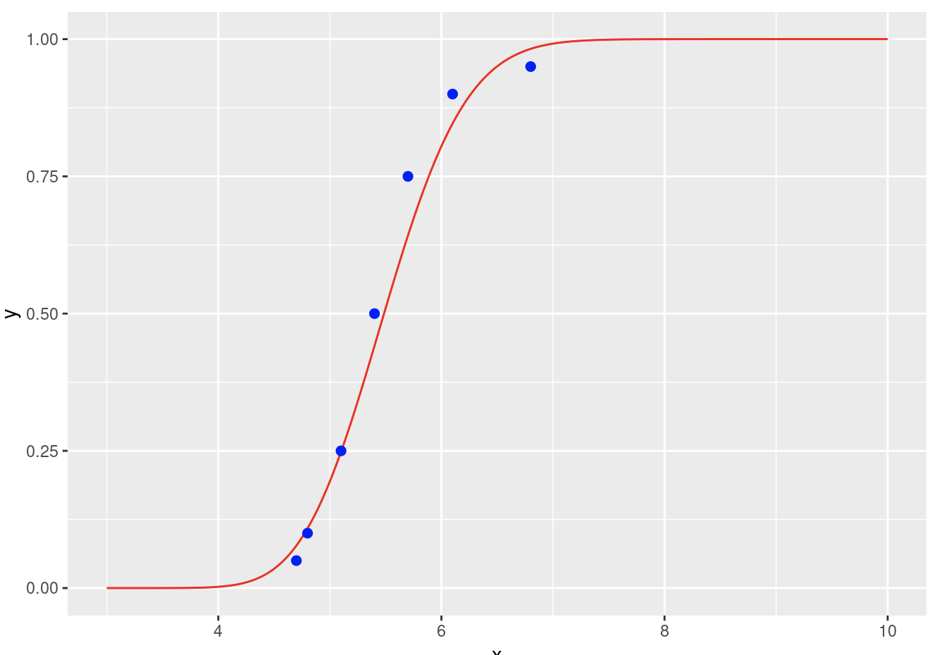
Lets see how this looks when plotted against the original data.
library(ggplot2)

df2 <- data.frame(x = seq(from = 3.0, to = 10.0, by = 0.01))
df2$y = pgamma(df2$x, fit$par[1], fit$par[2])

ggplot() +
    geom_line(aes(x, y), df2, color = "red") +
    geom_point(aes(value, quantile), df, size = 2, color = "blue")

There you go! If you only have a few data points and their quantiles, you can make a guess about their distribution. You can try this with multiple distributions and compare their resulting SSEs.
